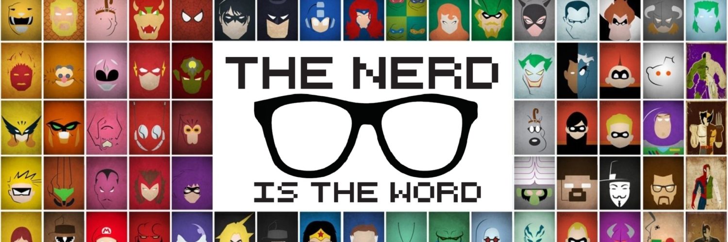
Have you ever gazed at your blank walls and thought to yourself… theses walls sure could use a poster.
Me too reader… me too.
Was it a coincidence that EXTREMEPANDA contacted us a few day’s after this thought? Probably, but that’s besides the point!
So what is EXTREMEPANDA?
Other than the coolest name and logo, EXTREMEPANDA is a modern design studio comprising of a group of like minded talented artists specializing in handmade and digital art. Working on art designs anywhere from film, movies, video games or pop culture, it is quite evident that they are quite good at what they do.
**This review is going to be broken down into 2 segments**
For those who do’t live in Canada (eh?) you might not know about the postage strike happening, unfortunately I won’t be getting the posters I ordered for quite some time, but that won’t stop me from critiquing the digital designs I chose. Once I get the posters I shall give my final review of EXTREMEPANDA!
What did I choose?
With 61 posters to choose from, it took quite some time to finally slim it down to 3 posters in the end.

The first image that caught my eye was this little man in blue. Some may not be familiar with this guy so ill give you an introduction… this is my childhood! Doom Guy plays a role as a major icon in gaming. While scrolling through their designs, not only did Doom Guy catch my eye but the vibrant blue highlights supporting the shadow background was the perfect choice of colour while the scuffed up “DOOM” represents the game and it’s gritty combat. Not only does the colour compliment Doom Guy, but the style compliments the game itself.

Our second choice had to be this Uncharted: A Thief’s End poster. Not only was it due to that I am currently playing this game (which I highly recommend!), it also has to do with the simplicity of the design but how complex it is at the same time. The colour scheme gives it almost a rusty feel and gives the feeling of a tropical island… how can one describe a pirate adventure any better?

Last but certainly not least I chose Deadpool. How else can I bring out my inner Canadian better than the merc with a mouth himself? Not just any Deadpool poster would catch my attention though, I could easily pick that up at any comic book shop if I wanted one. This one stood out to me. Surprisingly, the first thing that I noticed about this design was the bottom stroke underneath Deadpool and how it resembled a water colour painting. The vibrant red graffiti style also plays to Deadpools style as he don’t give 2 sh!ts about what people think.
Conclusion
While this postal strike has been a major pain in the butt, EXTREMEPANDA has been a delight dealing with the issues. Once they had found out about the strike, they had immediately notified me about the delay and will keep me informed once the strike has been resolved rather than me putting in another order – Now that is customer satisfaction! Their brilliant way of simplistic yet somehow complicated designs show us that sometimes keeping it simple is the best way to go. I look forward to receiving the posters and continuing on to Part 2 of the EXTREMEPANDA review.


Leave a Reply